Looking back at your preliminary task, what do you feel you have learnt in the progression from it to the full product?
At the start of the year I had created a ‘preliminary website’, this was a website based on a school. I designed two web pages on iWeb, I designed a home page and a media department page. I was not used to using ‘Apple Mac’ computers as I have been used to using Windows machines, so I was not used to using iWeb which is a software from Apple.
These two pages were full of images and persuasive language techniques to make the reader think that this is a good school for their son.

The colour scheme for my preliminary website was blue, having a colour scheme throughout the website is a useful technique as it looks professional. I chose the colour blue because I thought that if my school were for males then having a blue colour would represent that straight away.
I also feel that the light colored blue is a nice colour as it is not to in your face and keeps it looking professional.
When creating the website I took inspiration from a school called ‘Ravens Wood School’ as you can see in the image below I have a similar layout. I thought that the layout is very useful as it has everything you need to know on the page. The school has used a colour scheme of green, which is useful as the school is a school for boys. The website has also used images of students looking happy, this gives the impression to people that is a fun loving school.

Being a novice at iWeb I did not know how to use hyperlinks, so there is only one hyperlink on the website which links to the media department page and back to the home page. This is why doing a preliminary website was very useful as I had learnt some techniques from iWeb.
I am glad that I used a preliminary website because I had a better understanding using Macs and using iWeb, the errors that I had made on the preliminary website have been showed to me and this is why I feel I have had a better understanding in creating my main website, without the preliminary website I would have struggled.
What have you learnt about technologies from the process of constructing this product?
When I started the course I had no idea what iWeb was and I didn’t know how to work it at all. I had created a preliminary website to get a feel to iWeb, this helped me as I had learnt all new features and ways to make a good website.
Using iWeb is a good way to create a website, it beats using print work. I had learnt how to use rollovers, which is an effective way for people to know what is a link to another page and what isn’t. It is also a useful technique for a way to attract an audience, the rollover breaks up the page as it offers another color which makes it more cheerful.
I have also learnt about taking videos and putting it onto the website, I wanted to use a technique that many people use when having an interview and keeping it confidential so I used an idea that is often used. I interviewed a drug sufferer in front of a window so that his face becomes silhouette so his identity was kept secret. The website is trying to make the people who want to interact with us feel safe and secure knowing that no one will know about their addiction.
How did you attract/address your audience?
When looking for a young audience you have to think back to when you were young and think what would attract you to something.
I have decided to use bright colors for fonts and text boxes to attract the audience, a younger generation would look towards bright cheerful colors rather than white and black colors.
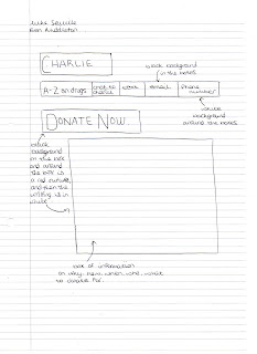
As you can see on my homepage, it is eye catchy by the size of the fonts and text boxes, the colors appear through a scroll over. The one text box that stands out from the others is the ‘DONATE NOW’ box, this is used because for my point of view this is the most important page of the website, having donations will help the website running successfully.


As you can see in this print screen, the color scheme is bright and in your face, this brings the readers attention to the page and makes them want to read on. This would appeal more to a younger audience like teenagers than adults.
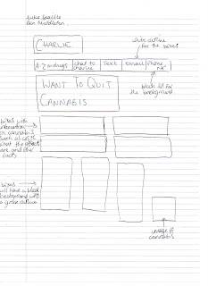
For the ‘WANT TO QUIT CANNABIS’ page I have decided to use the color scheme of green, this is an indication of cannabis. The green also stands out nicely and the background image makes the font stand out as well because the image is a light colour.
Who would be the audience for your media product?
Before I started designing my website/charity, I had said to myself that I wanted to aim my charity towards a younger audience. I wanted to help teenagers who were in trouble and wanted to talk to someone because I could relate to their problems.
For a business point of view I thought it would also be better targeting a younger audience because they have easy access to the Internet and they spend more time on the Internet than older people.
Another reason why I thought that aiming a target audience towards a younger generation would be effective is because people may think that the charity is more worthy than a charity that is for the environment or something.
My website represents the middle class and the lower middle class (social grade B, C1). By doing this I have decided to use larger images and less text, this will attract the lower class as a higher class would rather be reading something than viewing images.
The font is of a large size, this is another method I have used to attract a lower class of people. I have provided vital information for people rather than waffling on about something.
When talking about drug addicts, it is very rare that you are going to find a ‘social grade A’ group of people that are drug addicts. This is another way in which my website represents a lower classed group of people, it is more likely that they can relate to the website.
The images that I have used give a dull environment to them, I decided to do this because the topic of drugs and alochol is dull. People in a lower class could relate to this because having a dull environment could be the way in which they live in. The background images are of walls and fencing, I thought that this could give an affect of the viewer feeling enclosed so it could come accross that talking to ‘Chat To Charlie’ is confidential and the information that you tell them will not be told to anyone.
As you can see in the print screen on the left the background is of a fence, which gives the impression that the website is enclosed and is safe to talk to as the information will only be left with ‘Chat To Charlie’.

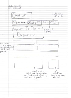
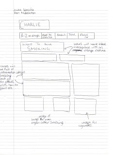
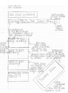
This is my home page, where it says ‘WANT TO QUIT BINGE DRINKING’, you can see the writing in red, it is normally in white but when the cursor scrolls over it changes to red, this happens to ‘WANT TO QUIT SMOKING’ accept that colour is amber, and ‘WANT TO QUIT CANABIS?’ is in a green colour, this is like I explained in my previous paragraph.
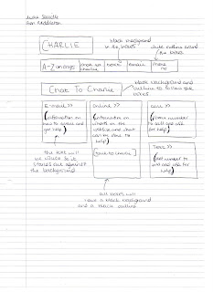
The text from the website is always in a box that has shade around, and the shade is coloured, I have done this so that it stands out and I have kept every piece of text coordinated to make it look more tidy instead of having different patterns for text. The colour of the inside of the box is black, this is done as effect because the campaign is quite dull and depressing because so many lives are ruined.
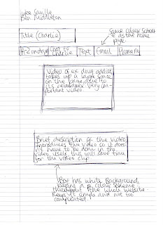
One of my pages is an interview with an ex drug addict, the page is very simple and just has a caption and a video on the page, this is done so that people can just focus on the video and nothing else because this page is very important so I wanted the readers to have full attention of what I wanted to get across to them.
I have three pages on quitting cannabis, alcohol and smoking cigarettes. This is done because all around the country many teenagers suffer from addiction of some of these examples. On the pages I have introduced some facts about each of them, this is done to let the viewers be aware of what they are dealing with. Obviously it is not done to scare the reader but we hope that they will give a second thought into what they are doing to their body. At the end of each page of the three we have left a message at the bottom saying ‘REMEMBER YOU CAN QUIT!’, this is done because we want to encourage our viewers because it is proven that to get rid of an addiction willpower is required so we are reminding our viewers that they can do it if they really want to.
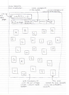
I have a page on A-Z drugs, each letter in the alphabet is filled with a colour, this is eye catchy, it brings the readers attention to the page and makes them want to read more. The size of the boxes aren’t all the same size because I wanted to space things out and I feel it looks better rather than having 26 boxes all the same size and shapes.

Chat To Charlie
This is the A-Z on drugs page, as you can see from the ‘Talk to Frank’ A-Z page that they are quite similar as I was inspired from this page as I thought it was effective as people can see what the drugs are if they have heard of it but aren’t too sure what it is.

Talk To Frank